
Every Room a Different Color? How to Build a Whole-Home Palette That Flows
August 30, 2026
Quick Answer: A whole-home color palette works when every room shares a common undertone even if the colors themselves change from space to space. Start by picking one anchor color you love, then build the rest of the house around its undertone, warm or cool, rather than matching every wall to the exact same shade. Let natural light guide where you go lighter or darker, keep trim and ceiling colors consistent throughout so they read as a frame rather than a patchwork, and always sample colors directly on your own walls before committing, since a swatch under store lighting almost never matches what happens in a north-facing hallway at four in the afternoon.
You open the paint fan deck at the store, pick five colors you love, and three weeks later your house looks like five different houses stitched together at the doorways. That's the most common color mistake we see, and it isn't a matter of taste. It's a sequencing problem. Homeowners pick colors room by room, in isolation, without ever stepping back to ask how the hallway between them is going to read.
A real whole-home palette isn't one color used everywhere. It's a small set of undertones and values that agree with each other, so your eye moves from the entry to the kitchen to the stairwell without a jolt. Get that right and a house with six different wall colors can feel more cohesive than one painted a single shade of white throughout. Get it wrong, and even a beautifully chosen individual color can feel like it landed in the wrong house.
What Makes a Palette Feel Whole Instead of Random
Cohesion in a house comes down to undertone consistency, not color matching. Every paint color, even a neutral gray or a soft white, carries an undertone underneath its surface color, a faint lean toward warm (red, orange, yellow) or cool (blue, green, purple). Two grays can look nearly identical on a swatch card and still clash on adjacent walls if one leans warm and the other leans cool.
The trick professional colorists use is to hold a color next to a pure, neutral reference and watch the undertone reveal itself. Put a white you're considering next to a true white and the undertone practically announces itself, a whisper of pink, green, or blue that was invisible in isolation. That same test works for anchor colors throughout a house. If your kitchen leans warm and your hallway leans cool, your eye registers the mismatch even if it can't name what's wrong.
Once you settle on a dominant undertone for the house, most of the hard decisions get easier. You're no longer picking colors one room at a time. You're picking values and saturation levels within a family that already agrees with itself.
Start With How Light Actually Moves Through Your Home
Before you fall in love with a swatch, walk your house at three different times of day. Morning, midday, and early evening light change color in ways that surprise most homeowners, and a shade that looks perfect at noon can turn flat and gray by 6pm.
North-facing rooms get the coolest, flattest light in the house. Colors read consistently cooler and less saturated than they would under direct sun, so a pale blue or green that felt fresh at the store can turn a little cold and lifeless on a north wall. Warming the undertone, leaning toward a color with a hint of pink or yellow underneath, keeps these rooms from feeling flat.
South-facing rooms are the opposite problem. They get warm, golden light most of the day, which pushes cool whites toward neutral and pushes warm whites toward outright cream. Bold saturated colors read especially rich here, while pale cool colors can wash out.
East and west-facing rooms shift the most over a single day. A bedroom that faces east glows warm in the morning and goes cooler and more muted by evening. Kitchens and living rooms facing west do the reverse. In these rooms, sampling at a single moment tells you almost nothing about how the color behaves the rest of the day.
Tip: Paint a two-foot swatch directly on the wall in question, not on a poster board you carry from room to room. Look at it in the morning, at midday, and again after dark with your lamps on. A color that survives all three checks is one you can trust. A color you only love in one lighting condition is a color you'll be repainting.
Choosing an Anchor and Letting the Rest of the House Follow
Most successful whole-home palettes start with one color the homeowner already loves, a favorite blue for a bedroom, a rich green for a study, a warm neutral for the living room. That color becomes the anchor, and everything else in the house gets chosen to sit comfortably next to it.
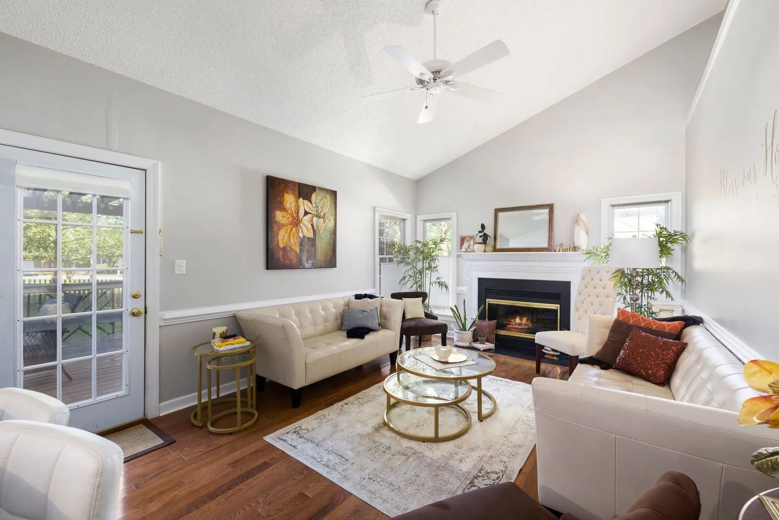
From there, the job is repetition with variation. Carry the anchor's undertone into the other rooms without necessarily repeating the exact color. A warm greige in the living room might show up as a lighter cream in the hallway and a deeper taupe on an accent wall upstairs, all sharing the same warm base. That repetition is what creates flow between spaces, not identical paint cans in every room.
Depth is the tool you adjust room to room, not direction. A north-facing dining room next to a south-facing kitchen can wear the same undertone at two different values, darker where the light is flattest, lighter where the light runs warm and strong, and the two rooms will still feel like they belong to the same house.
Trim, Doors, and Ceilings Do the Connecting Work
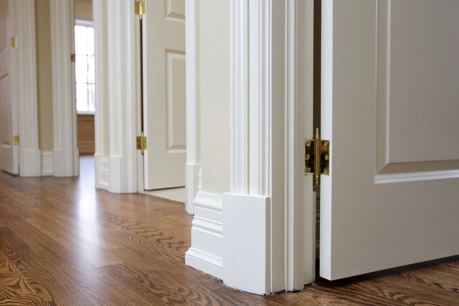
Walls change color from room to room, but trim usually shouldn't. Keeping a single trim color, and a single ceiling color, consistent throughout the whole house gives every room a shared frame, and that frame is doing more of the cohesion work than most homeowners realize. Walk into a house with six wall colors and one consistent trim white, and it reads as intentional. Walk into a house with six wall colors and six different trim colors, and it reads as chaos.
We treat trim as connective tissue on every whole-home project. It's also one of the hardest-working surfaces in your house, handled daily at doorknobs, window sills, and stair rails, which is a separate conversation about durability and finish. For the purposes of a color palette, just remember that consistent trim ties disparate rooms together even when the wall colors themselves range widely.
Where Southeastern Pennsylvania Homes Change the Plan
A color guide written for a generic new-construction house doesn't always translate to a century-old stone farmhouse in Chester County or a mid-century rancher in Norristown. Older homes here carry plaster walls, deep window returns, and rooms with less consistent natural light than a modern open floor plan, and all of that affects how a palette behaves.
Deep-set windows common in older Phoenixville and Collegeville homes cast more shadow along the wall, which darkens a color's apparent value compared to a room with a shallow modern window frame. A shade that reads medium on the fan deck can look noticeably darker once it's on a wall with a foot of shadow falling across it from a deep sill.
The four-season swing here matters too. A palette you fall in love with during a bright July afternoon needs to hold up equally well under gray February light, when the sun sits low and the days run short. Warmer undertones tend to weather that seasonal shift more gracefully than icy cool tones, which can feel stark during the darker months.
Warning:
Don't finalize a whole-home palette based on a single sunny-day walkthrough. Southeastern Pennsylvania swings from bright summer light to overcast winter skies more than most regions, and a palette that only gets tested on a good-weather day is a palette you haven't actually tested. Look at your samples on a cloudy day too, especially in rooms without much artificial light backup.
Working Room by Room Without Losing the Thread
Public rooms, the entry, hallway, living room, and dining room, benefit most from tight undertone consistency, since they're often visible from each other in an open layout. This is where a wrong undertone gets noticed fastest, because your eye can see two rooms at once from a single vantage point.
Bedrooms and other private rooms have more room to breathe. A kid's room can lean into a saturated blue or green that would feel out of place downstairs, as long as the trim stays consistent with the rest of the house and the undertone doesn't clash violently with what's visible from the hallway door.
Kitchens and bathrooms carry their own pressures beyond color, since these rooms deal with moisture, grease, and heavy daily wear, but the undertone rule still applies. A kitchen with warm wood cabinets reads awkwardly next to a stark cool-gray hallway. Matching the undertone, even at a different value, smooths that transition.
Stairwells and hallways are the connective spaces most homeowners forget to plan for, and they're often the hardest rooms in the house to sample properly since they get light from multiple directions at once. Treat these as transition zones. A hallway color pulled from the same family as the two rooms it connects will always outperform a color chosen in isolation.
Prep Determines Whether a Color Reads True
Even a perfectly chosen palette can look wrong on a poorly prepped wall. Old paint layers, patched drywall, and uneven plaster all interact with new color differently than a clean, primed surface does. A color that tested beautifully on a sample board can shift subtly when it goes over old glossy paint that wasn't sanded first, or over a patch that wasn't primed before the topcoat.
We spend real time on surface prep before color ever enters the conversation, because the smoothest, most evenly primed wall is the one that lets a color show up exactly as intended. Skipping that step is one of the most common reasons a carefully chosen palette looks patchy or uneven once it's actually on the walls.
Frequently Asked Questions
How many colors should a whole-home palette actually include?
Most cohesive homes use somewhere between three and six wall colors total, built around one or two shared undertones, plus a single consistent trim color throughout. More than that and the house risks feeling scattered. Fewer than that can feel flat in a larger home with distinct rooms.
Should every room in an open floor plan be the same color?
Not necessarily, but adjacent open spaces should share an undertone even if the values differ. A kitchen and living room that flow into each other can wear two different colors from the same family and still feel unified, while two colors from opposing undertones in the same sightline will always compete.
Can I mix warm and cool colors in one house?
You can, but it takes intention. A house with a warm downstairs and a cooler-toned primary suite upstairs can work if the transition happens somewhere logical, like a stairwell, rather than across two rooms that share a doorway.
How do I know if a color has changed since I last painted?
Paint formulas and pigment sourcing shift over time even under the same name, and older cans can also shift color slightly as they age in storage. If you're matching new paint to an older wall, always test a fresh sample against the existing color rather than trusting the can label alone.
Does the same palette work for a small house and a large one?
The undertone principle holds either way, but a smaller house usually benefits from fewer distinct colors since rooms sit closer together and sightlines overlap more. A larger house with more separation between rooms can support a wider range of values within the same family.
Building Lasting Harmony Through Thoughtful Color Choices
For homeowners in Phoenixville, PA, creating a whole-home palette is less about finding the perfect individual paint color and more about understanding how every space relates to the next. Light, undertones, architectural details, and consistent finishing elements all influence whether rooms feel naturally connected or disconnected. With 20+ years of experience, Miguel's Painting understands how these factors come together to create interiors that remain balanced through changing seasons, different lighting conditions, and the character of older as well as newer homes.
A carefully planned palette also gives your home flexibility over time. Furniture, artwork, flooring, and décor can evolve without making painted walls feel outdated or mismatched. By establishing a consistent visual foundation instead of chasing individual color trends, every future decorating decision becomes easier. The result is a home that feels intentional from room to room, where each space has its own personality while still contributing to a cohesive, comfortable environment.